
«Yummy» — это не просто кафе с мороженым, а проект, меняющий традиционное восприятие десерта, превращая его в захватывающее и гастрономичное путешествие. Уникальное место, где каждый может попробовать необычные и оригинальные вкусы мороженого, выходящие за рамки классических вариантов. Основная цель проекта — создать атмосферу открытий и экспериментов со вкусом, предлагая клиентам нестандартные, яркие и запоминающиеся вкусовые сочетания, которые расширяют представление о мороженом как охлаждающем десерте.
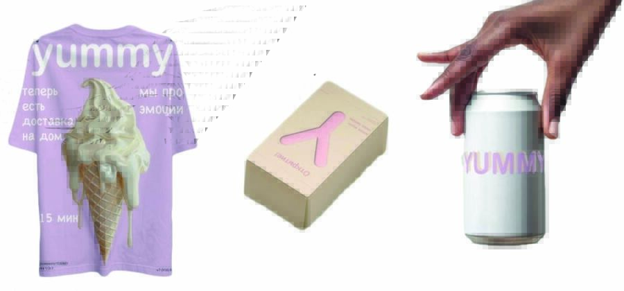
Оригинальный мерч по тематике yummy
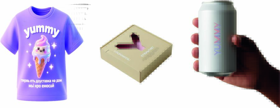
Мерч созданный искусственным интеллектом.
Нейросеть: Qwen
Промпты:
yummy merchandise, purple tshirt, ice cream cone with melting ice cream, white text 'yummy', phrases 'теперь есть доставка на дом' and 'мы про эмоции», 15 minutes, digital art, fantasy and cute style, plain white background, high-quality print, streetwear design, soft and clean composition.
Studio product photography, minimalist, high-angle shot of a light beige cardboard rectangular box. The box is positioned at a slight angle, showing its top and front faces. On the top face, there is a die-cut opening in the shape of a stylized «Y» or an inverted checkmark. Through the opening, a soft pink object or insert is visible. Next to the cut-out, there is a Cyrillic text «ОТКРЫТИЕ!» in a thin, sans-serif font, slightly slanted. Below and to the side of this main text, there are a few lines of small, illegible text. The background is pure white, clean, and seamless. Lighting is soft, even, and studio-quality, with no harsh shadows. Focus is sharp on the box. Realistic, clean aesthetic.
A close-up, studio-style product shot of a plain white, matte aluminum soda can. The can is held delicately between the thumb and forefinger of a person’s hand. The hand has a medium to dark skin tone and is positioned on the right side of the frame. The fingers are slightly curved, showcasing the side of the can. The word «YUMMY» is printed on the can in a soft, gradient pastel font, with colors subtly shifting from pale pink to light lavender. The background is a clean, neutral, and slightly textured light beige or off-white wall, creating a minimalist and modern aesthetic. The lighting is soft and diffused, highlighting the texture of the can and the hand without harsh shadows
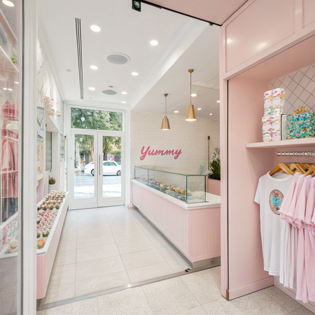
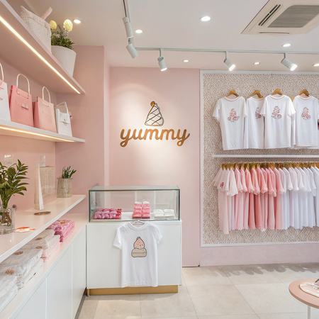
ПРОСТРАНСТВО: Магазин мерча / кафе мороженого.
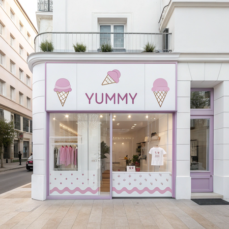
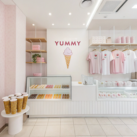
Нейросеть: Recraft
Промпты:
«A bright, clean, and modern merchandise store interior for the ice cream brand 'YUMMY'. The overall aesthetic is dominated by soft pastel pink and crisp white. In the foreground and mid-ground, display racks and shelves showcase various branded merchandise:
- T-shirts: Plain white and light pink t-shirts with the 'YUMMY' logo prominently displayed. The logo should be in a soft pastel gradient (pink to lavender, as described previously, or similar soft tones) or a clean white/pink design. Some t-shirts are neatly folded on shelves, while others are displayed on mannequins or hangers.
- Ice Cream: Several stylized scoops of unusual ice cream flavors are presented in transparent cups or waffle cones. Examples of unusual flavors could be hinted at through playful visual cues: a scoop with edible glitter, a bright blue swirl, a vibrant green hue, or a black colored ice cream with white speckles. These are displayed in a visually appealing, artful manner on a counter or dedicated display.
- Tote bags: White and light pink tote bags with the 'YUMMY' logo printed on them. Some are hanging, others are stacked.
The store should feel inviting and trendy. Natural light streams in, illuminating the space. Subtle branding elements like small 'YUMMY' logos on shelves, price tags, or wall decor should be present but not overwhelming. The color palette should consistently incorporate shades of pink (from blush to pastel) and white, with perhaps very minimal, accent colors for the ice cream flavors themselves that don’t disrupt the main theme. Focus on a clean, organized, and visually appealing layout, capturing the essence of a fun, modern ice cream brand.»
НОСИТЕЛИ / ТОВАРЫ
Нейросеть: Recraft
Промпты:
Design a unique cap for the ice cream café project called «Yummy,» which specializes in unusual flavors. The design should feature soft pink and white color palette to create an elegant yet playful look that resonates with the brand’s identity.
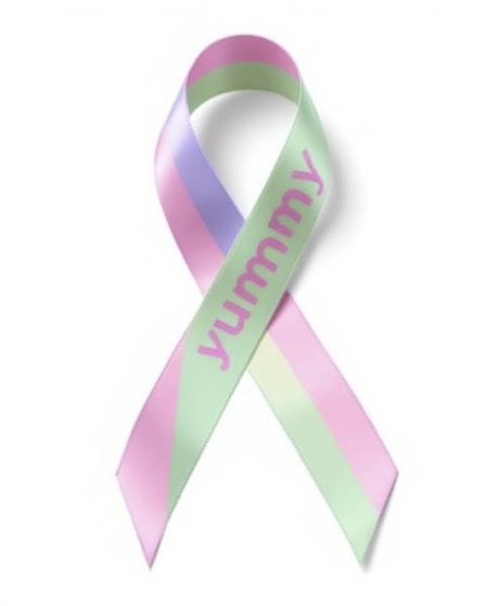
Create a comprehensive design brief for a ribbon specifically intended for Yummy Ice Cream Café, renowned for its extraordinary flavor profiles. This ribbon serves dual purposes: enhancing visual appeal and reinforcing brand identity.
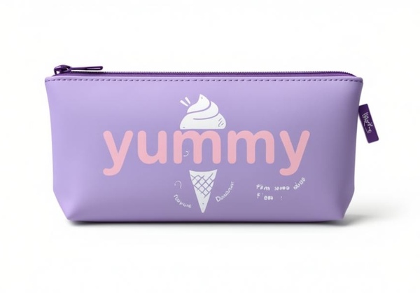
Design a pencil case for the Yummy Ice Cream Café project, focusing on its theme of offering unique and delightfully quirky flavors. The pencil case should embody the vibrant spirit of the café while maintaining a sophisticated aesthetic.
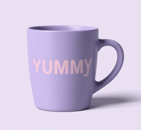
Create a detailed design concept for a mug specifically tailored for Yummy Ice Cream Café, known for its unique and innovative flavor combinations. This design will serve both functional and promotional purposes, enhancing customer experience and brand visibility.
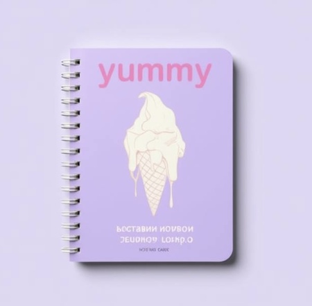
Design a notebook exclusively for the Yummy Ice Cream Café, centered around its exceptional array of uniquely flavored ice cream creations. The primary objective is to develop a visually appealing and functional item that reflects the café's charming personality.
АЙДЕНТИКА
Логотип и цветовое решение, основанные на тематике кафе мороженого и магазина мерча yummy, созданный нейросетью.
Нейросеть: Recraft
Промпт:
Create a simple, elegant, and modern wordmark logo for «Yummy». The logo should consist solely of the text «Yummy» rendered in a clean, stylish font.
- Text: The word «Yummy»
- Font Style: A soft, rounded, and elegant sans-serif font. The letters should have smooth curves and a clean, readable design. Avoid overly decorative, script, or chunky fonts. Think sophistication with a touch of sweetness.
- Color Palette: * The logo must use only the following colors: Primary: Soft Pink* (e.g., pastel pink, blush). Secondary: Gentle Lavender / Light Purple* (e.g., lilac, light amethyst). Accent/Outline: * Clean White or a very light, subtle off-white/cream.
- Application of Colors: * The colors should be applied thoughtfully to the letters of «Yummy». Possible options include: Each letter having a slightly different shade within the palette (e.g., Y — soft pink, u — light purple, m — white, m — soft pink, y — light purple). A gradient blend of soft pink and light purple across the word. White text with a soft pink or lavender outline. Soft pink text with a lavender shadow or subtle highlight. The goal is a harmonious and cohesive look using only these three colors.
- Style: * Minimalist, sophisticated, and sweet. The focus is entirely on the typography and color. It should be clean, easily scalable, and convey a sense of premium yet gentle quality.
- Background: * The logo should be presented on a plain white or very light cream background* to ensure the colors stand out.
Описание процессов производства изображений
Использованные модели: Recraft, Qwen
Поиск цвета: Adobe Color


