Ребрендинг журнала Ликбез по провалам
Это журнал, созданный на базе приложения для здоровья WBC, который объединяет комьюнити людей со слабым здоровьем и иммунитетом через необычные, забавные и порой абсурдные истории про болезни. Такой журнал помогает развеять страхи, снять напряжение и напомнить, что все мы остаёмся уязвимыми и несовершенными, несмотря на любые диагнозы.
Ребрендинг от ИИ
В ходе разработки этого проекта, мною будут использованы такие ресурсы, как: Ideogram Font Brief Qwen Perplexity Adobe Color DeepSeek
Метафора для нового фирменного стиля (предложил Perplexity): «Ликбез по провалам» — проект объединяет людей с разными, иногда несовершенными, но уникальными историями, создавая из них тёплое, поддерживающее и разнообразное сообщество, где каждый лоскуток важен и ценен.
Генерации логотипа выполнена с помощью нейросети Ideogram, а поиск шрифтового решения—Font Brief.
Логотип
Для генерации логотипа сначала я создала промпт в Perplexity, а затем вставила его в Ideogram.
Prompt: Create a modern, friendly, and community-focused logo redesign for a project called WBC. The project is a magazine and health app for people with weak immunity, aiming to support and unite the community with humor and relatable stories about health. The new logo should convey warmth, support, positivity, and inclusivity, while remaining simple and recognizable. Avoid clinical or overly medical style; aim for a welcoming and uplifting visual identity.
Цвета
Палитра создана с помощью Adobe Color
Шрифты
Шрифты подобраны с помощью Font Brief
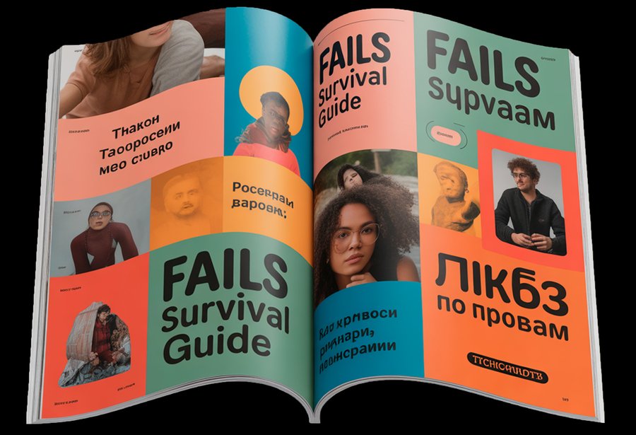
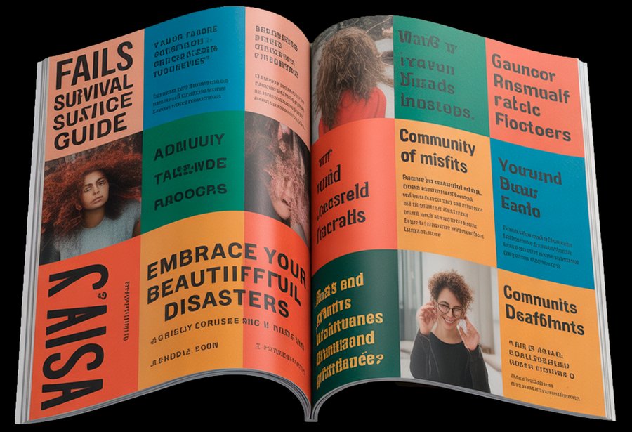
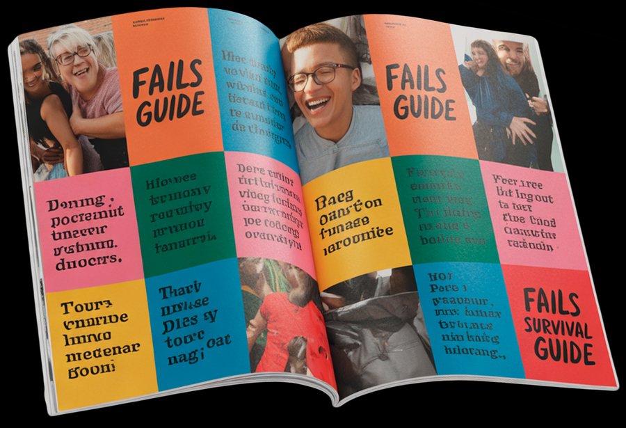
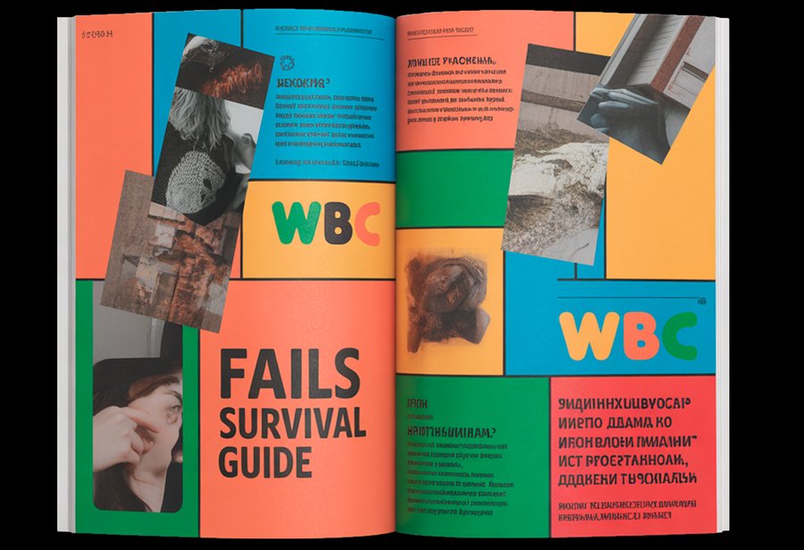
Страницы журнала
Для генерации журнала сначала я создала промпт в Perplexity, а затем вставила его в Ideogram.
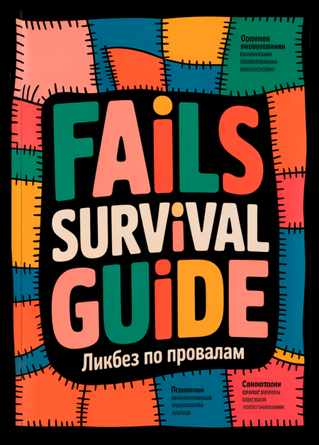
Prompt: Create a realistic magazine mockup of «Fails Survival Guide» featuring a vibrant patchwork layout using the WBC color palette (F27E88, 04ADBF, 3A8C46, F28F16, F25430) against black backgrounds. Design the spread with collage-style arrangements, overlapping authentic photography, and irregular story blocks in the brand’s playful typography (Doughy for headlines, Agrandir for body text, Tschichold for captions). Incorporate the patchwork metaphor through geometric color blocks and diverse content layouts that balance humor and support. Present the design as a photographed open magazine to show how the spread appears in context, emphasizing the contrast between the black background and vibrant elements.
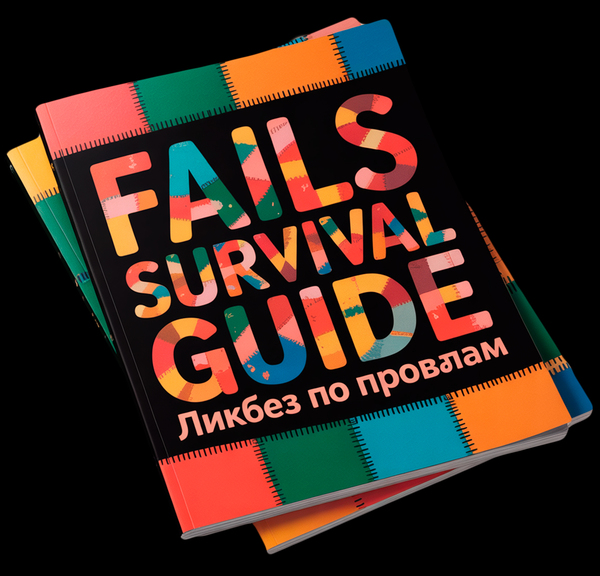
Обложки журнала
Для генерации обложек сначала я создала промпт в Perplexity, а затем вставила его в Ideogram.
Prompt: Create a realistic magazine mockup for «Fails Survival Guide» featuring a vibrant patchwork design inspired by the WBC brand. Use the specified color palette (F27E88, 04ADBF, 3A8C46, F28F16, F25430) against a neutral black background to maximize contrast. Implement the typography hierarchy with Doughy for headlines, Agrandir for subtitles, and Tschichold for body text. The cover should visually represent the patchwork concept — showcasing how diverse, imperfect stories create a cohesive whole through overlapping color blocks and geometric shapes. Present the design on a photorealistic magazine mockup in context, demonstrating how it would appear as an actual printed publication.

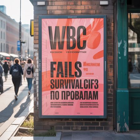
Рекламные постеры
Для генерации рекламных постеров и банеров сначала я создала промпт в Qwen, в качестве референсов показав логотип и цвета, а затем в Qwen сгенерировала изображения.
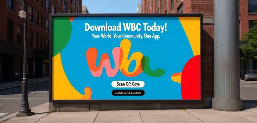
Prompts: 1. Create an advertising poster for «Fails Survival Guide» displayed on a realistic city street wall mockup. Use a solid background of one WBC brand color (F27E88, 04ADBF, 3A8C46, F28F16, or F25430) with the distinctive multi-colored WBC logo prominently featured. Employ the brand’s typography hierarchy — Doughy for bold headlines, Agrandir for supporting text, and Tschichold for details — all in high-contrast white. Design should embody the patchwork community concept through dynamic text arrangement and imperfect geometric elements, creating a bold, energetic composition that celebrates inclusivity and imperfection. Show the poster as physically installed in an urban environment with realistic lighting and surface textures.
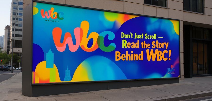
2. Create a vibrant outdoor poster for a WBC magazine using bold blue, yellow, green, and red, featuring a large central slogan like «Don’t Just Scroll — Read the Story!», a small corner logo, and a modern, playful style, shown mounted at a slight angle on an urban wall or pillar.

Дополнительные носители
Для генерации стикеров я создала промпт и сгенерировала изображения в Qwen, в качестве референсов показав логотип и цвета.
Prompt: Create 5 vibrant sticker designs with transparent backgrounds for WBC. Use only the brand’s colors: Bright Orange, Soft Pink, Warm Yellow-Orange, Teal Blue, Forest Green, plus Dark Gray and White. Apply the font hierarchy: Doughy for headlines, Agrandir for supporting text. Create dynamic collage layouts with overlapping color blocks and angular cuts. Feature the multi-colored «WBC» logo in 2 designs and include witty phrases like «FAILS SURVIVAL GUIDE». Maintain the brand’s energetic, slightly chaotic aesthetic.
Для генерации пакетов я создала промпт и сгенерировала изображения в Qwen, в качестве референсов показав логотип и цвета.
Prompt: Design photorealistic matte black shopping bags for WBC magazine featuring bold color blocks in bright orange, pink, yellow, teal and green. Prominently display the multi-colored «WBC» logo and use the brand’s font hierarchy: Doughy for headlines, Agrandir for subtext. Create 2-3 variations using geometric layouts from the magazine’s collage aesthetic, showing bags being carried. Maintain high contrast using only specified colors against the black background.
Магазин
Для генерации магазина я создала промпт и сгенерировала изображения в Qwen, в качестве референсов показав обложки журнала.
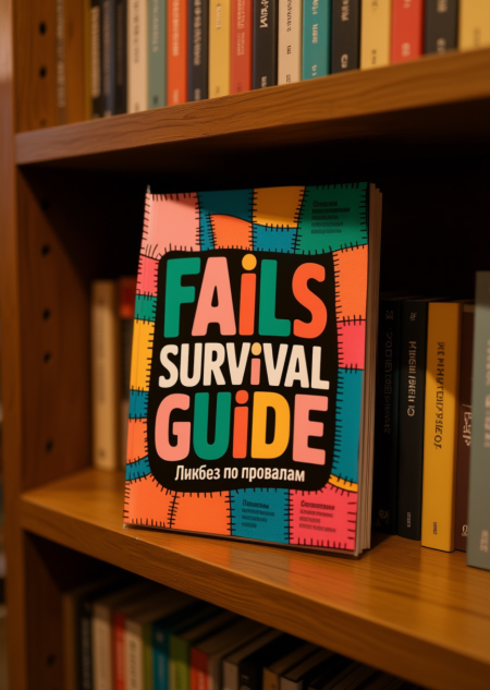
Prompts: 1. A photorealistic, high-resolution image of the «Fails Survival Guide» magazine cover lying flat on a wooden bookshelf inside a cozy, well-lit bookstore. The cover features bold, colorful, blocky text reading «FAILS SURVIVAL GUIDE» with Russian text «Ликбез по провалам» underneath. The background of the cover has a patchwork quilt design with vibrant orange, teal, pink, and yellow squares stitched together. The bookshelf is filled with other books, slightly out of focus, creating a sense of depth. Soft, warm lighting from overhead lamps highlights the texture of the magazine’s glossy cover and the wood grain of the shelf. The overall atmosphere is inviting and quiet, typical of a charming independent bookstore.
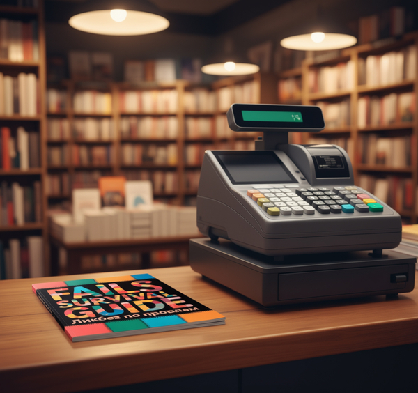
2. A magazine titled «FAILS SURVIVAL GUIDE» with colorful, patchwork-style lettering and Russian text «Ликбез по провалам» on its cover, lying on a wooden counter in a cozy bookstore. The magazine is positioned right in front of a modern cash register, as if it’s about to be scanned for purchase. The scene is warmly
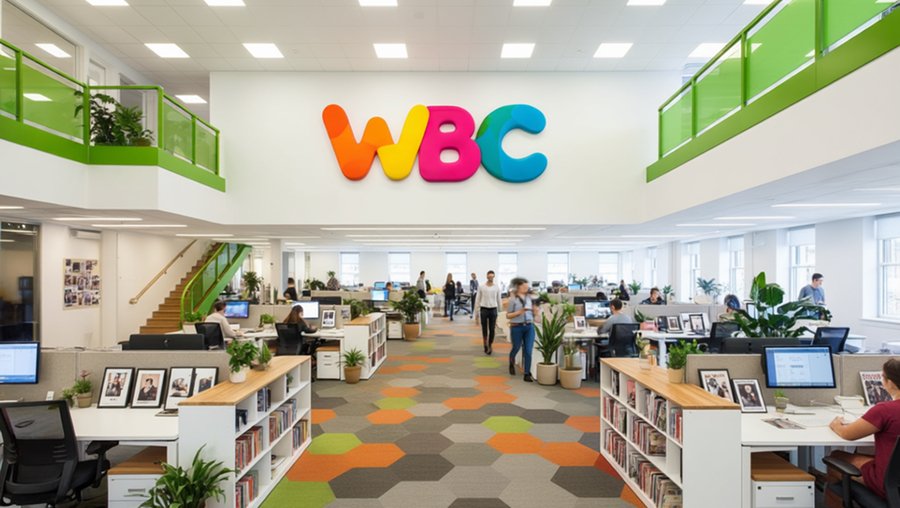
Здание издательства
Для генерации здания издательства я создала промпт и сгенерировала изображения в Qwen, в качестве референсов показав логотип и цвета.
Prompt: Photorealistic, wide-angle shot of a modern magazine publisher’s office at night. Industrial-chic aesthetic with exposed concrete beams and a vibrant city skyline through large windows. A large, light-wood worktable in the foreground is cluttered with design tools (cutting mat, sketchbooks, pencils). Behind it are workstations with warm-toned fabric dividers. Focal point: The large, colorful «WBC» logo on the back brick wall, rendered in its signature overlapping wavy colors (orange, pink, yellow-orange, blue, green). The logo must be prominent, well-lit, and clearly brand the space. Warm, ambient lighting from ceiling spotlights and desk lamps creates a cozy, energetic atmosphere for a creative team working late.


")
")