Longread translated automatically
Original size 2480x3500

PITCHUZHKA is a brand of modernised Russian-style toys.

1913

PITCHUZHKA is a brand of modernised modular toys with a history that unites generations of Russian times and peoples. These are modern toys with modern forms that refer to our country’s ancient historical toys and ornaments. == sync, corrected by elderman == @elder_man

Original size 3500x2480

Metaphor brand = design of the past It is to connect the present with the past by connecting the parts of the design in the new Russian style Package-tubus with rotating parts simulating modules and 3 variations of toy assembly, and continues this idea

Original size 3500x2480

Packaging mechanics

1. Toy Collections

GZEL COCKREL BIRD

0
1/2

A symbol of good luck, courage, protection from dark forces.

Original size 3500x2480

GZEL LADY DOLL

0
1/2

Symbol of youth, freshness, life, and eternal spring

Original size 3500x2480

DYMKOV ROLLER HORSE

0
1/3

A symbol of joy every day and life itself

Original size 3500x2480

A symbol of well-being and wealth

Original size 3500x2480

KHOKHLOMA BIRD FAMILY

Original size 3500x2480

A symbol of the well-being of the family, protecting the family

Original size 3500x2480

KHOKHLOMA MATRYOSHKA DOLL

PITCHUZHKA is a brand of modernised Russian-style toys.
Алина Шеногина создала бренд PITCHUZHKA, объединяющий модернизированные игрушки в стиле русских промыслов и исторических орнаментов. Проект включает модульные игрушки и упаковку-тубус с вращающимися частями, отражающую концепцию соединения прошлого и настоящего.
Project description created with AI
1913
Project created at 27.05.2024
More projects in identity & branding
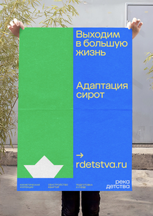
Фонд «Река детства» помогает детям, оставшимся без попечения родителей, адаптироваться в обществе, а Анастасия Головина разработала его визуальную концепцию. Проект использует графическую метафору шлюза на реке, символизирующую поддержку и преодоление трудностей детьми.
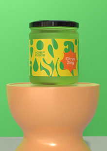
Екатерина Короткова разработала упаковку для меда Honey Fusion, стартапа из Кыргызстана, производящего мед-суфле с добавками. Проект включает авторский акцидентный шрифт, вдохновленный структурой меда-суфле.
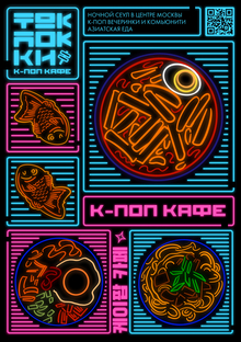
Автор разработала ребрендинг для кафе Tokpokki, которое предлагает блюда южнокорейской кухни и атмосферу ночного Сеула. Проект включает в себя концепцию к-pop кафе с DJ-вечеринками в стиле korean k-pop, hip-hop и rap.
Автор создала центра психологической помощи для облаков «CLOUDY», где помогают грустным тучам справиться с эмоциями. Проект представляет собой текст, в котором облака описываются как живые существа, испытывающие эмоции и нуждающиеся в поддержке.
hsedesign
hsedesign.com is the digital ecosystem brought by HSE ART AND DESIGN SCHOOL. It combines a professional portfolio for designers — students, graduates, and professors — with an online educational platform and a hub that aggregates international competitions in creative industries, among other digital services. ... Show more
design
object design
art
fashion
environment
game design
illustration
animation
cgi
sound
all the directions
fabrika
We use cookies to improve the operation of the HSE website and to enhance its usability. More detailed information on the use of cookies can be fou...
Show more