Original size 4750x6667

Seafood packaging for athletes MORETUT

big
Original size 6667x863

MORETUT is a seafood brand for people who need to monitor their nutrition. They spend a lot of time calculating the norm of proteins, fats and carbohydrates every day. But, they do not want to waste their precious resource on choosing a product from the shelf. Therefore, the packaging design of the SEA HERE is as clear as possible and grasps on the fly.

Differentiation using branded patterns has been developed for different types of products. These categories include: fresh frozen seafood (mussels, shrimp, octopus, etc.), snack dishes (riets, pates, etc.), delicacies (caviar of various types) and semi-finished products (crab cutlets, fish in citrus marinade, etc.).

Thus, it is even easier for a person to read the product on the shelf and decide on the choice of goods faster.

big
Original size 6667x863
big
Original size 2200x1540
big
Original size 2200x1540
Original size 6667x4751
Original size 6668x4751
Original size 6667x4751
Original size 6668x4751
Original size 6667x863
Seafood packaging for athletes MORETUT
Анастасия Кузина создала упаковку для морепродуктов бренда MORETUT, предназначенную для спортсменов и людей, следящих за питанием. Дизайн упаковки включает уникальные узоры для различения категорий продуктов, таких как замороженные моллюски, закуски и полуфабрикаты.
Project description created with AI
Project created at 10.10.2024
More projects in packaging design
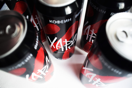
Автор создала дизайн-проект упаковки энергетического напитка "Хард". Упаковка позволяет взять в два раза больше энергетика для большой компании.
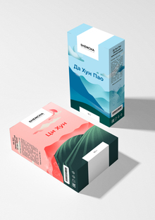
Марина Трубицына представила проект о китайском чае SHENCHA, описывающем три вида чая и атмосферу чайных плантаций. Проект включает текст, описывающий особенности заваривания и вкусовые качества чая, представленного в упаковке.
Asya Firsova создала тексты для проекта LICATE - with care, подчеркивающего заботу о питомцах через холистический подход к кормлению. Проект включает метафорическую лапку собаки, символизирующую слоган "with care" и используемую как элемент дизайна упаковки.
Дарья Родионова создала интерактивную упаковку для чак-чака, которая передаёт татарскую аутентичность и привлекает молодых людей. Проект представляет собой упаковку, сочетающую традиционные элементы и современный дизайн для сувенирного рынка Татарстана.
We use cookies to improve the operation of the HSE website and to enhance its usability. More detailed information on the use of cookies can be fou...
Show more